Securities Research
Building A Python Tool For Securities Research
Introduction
In May of 2020, I completed my first financial accounting course at Michigan State University’s Broad college of business. This course motivated me to learn more about the inner mechanisms and cashflows of businesses. I started to look through company financial statements on yahoo finance but was quickly overwhelmed. The amount of time needed to look through financial statements and to calculate financial ratios was enormous. After discovering this problem, I started this project in the hopes of building a tool that would help me more effectively research securities.
The Tool
I started this project by researching different python libraries that scrape data from yahoo finance. I discovered the yahoo-fin library and began writing some code. The tool that I have created starts by cycling through a list of companies. For every company, important financial information from the balance sheet, income statement, and the statement of cash flows is saved. This financial information is then used to generate financial ratios for every company in the list. The code will calculate each ratio for the current year plus the previous three years. My program calculates the following financial ratios:
• Current Ratio
• Working Capital
• Debt to Equity Ratio
• Debt to Assets Ratio
• Gross Profit Margin
• Net Profit Margin
• Total Asset Turnover
• Return on Assets
• Inventory Turnover Ratio
• Average Days to Sell Inventory
• Fixed Asset Turnover Ratio
• Accounts Payable Turnover
• Average Age of Payables
• Times Interest Earned Ratio
• Quality of Income Ratio
All this financial data is recorded and exported into a CSV file. This CSV can then be used for further analysis. Here is an example of how I used financial data produced by my tool:
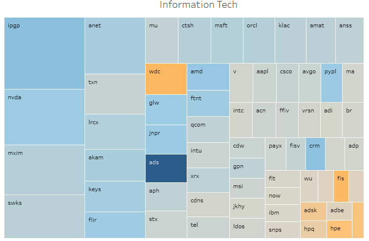
Each square represents a different company (The labels are the company’s ticker symbol). The larger the square, the larger the current ratio. The color for this figure represents the quality of income ratio. A company with a high quality of income will be dark blue, and a company with a low quality of income will be a shade of orange. This graph is very informative and shows company liquidity and cash flows compared to net income.